


3D Visualization

2024
Boost Solutions didn’t come to us with a brand problem. They came with momentum.
They were building apps, launching platforms, and scaling systems at speed.But the brand - how it looked, felt, and communicated - hadn’t kept up with their ambition.
So we set out to build an identity that could match the velocity of their work. Something sharp, scalable, and unmistakably theirs.
Identity
We approached the brand not as a surface treatment, but as an engine.
The visual system needed to express clarity and capability - but also direction. Purpose. Lift.
The result is a brand that moves like the company itself: fast, focused, and built for impact.

Logo
The Boost logo is a symbol of trajectory.
It borrows the silhouette of a figure rising - arms wide, feet sharp, motion captured in stillness.
It’s more than a mark. It’s a graphic metaphor for acceleration.
The bold sans-serif logotype balances the symbolism with weight and confidence.
Together, they feel like a promise: not just to move, but to move forward.

Primary logo

Secondary logo
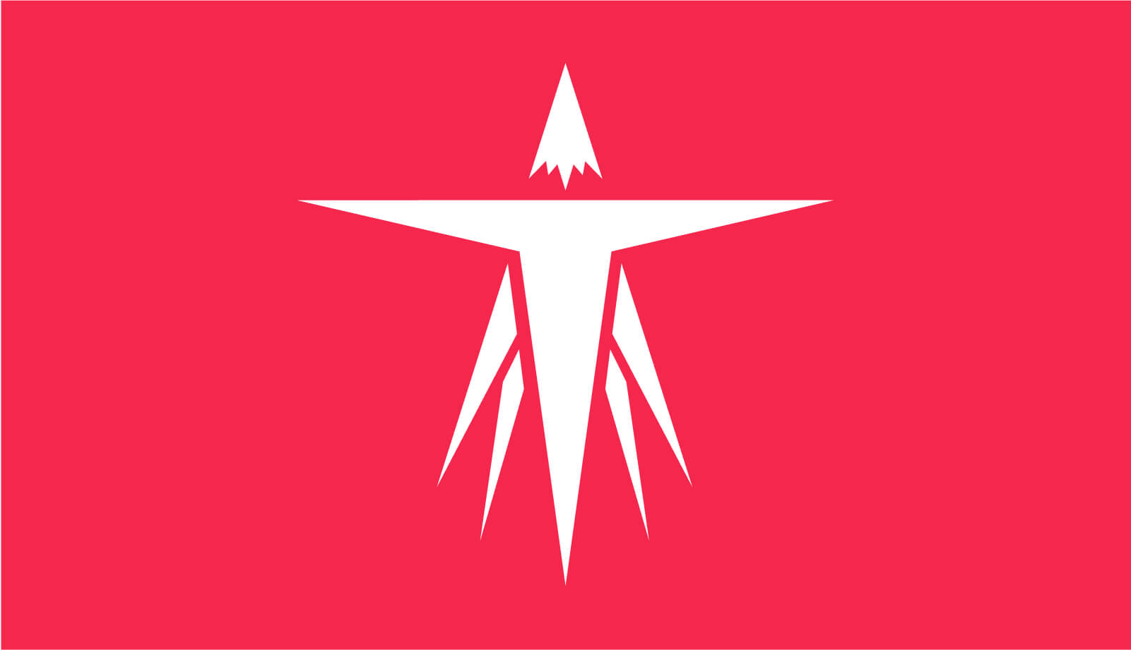

Logo symbol
Typography
Boost’s typography system is all about efficiency with flair.
Montserrat serves as the primary typeface - a geometric sans with both strength and agility. It scales from dense data to bold headlines without losing its clean, contemporary tone.
San Francisco Pro Text supports in smaller roles - engineered for digital readability and OS-native clarity. It’s fast, neutral, and frictionless - perfect for UI-heavy interfaces and cross-platform consistency.
Together, they create a system that’s direct but polished. Practical, but never generic. The tone is: “We get it done - and we know how to make it look sharp.”

Primary typeface

Secondary typeface
Colors
The Boost color palette was designed for clarity, edge, and energy.
- Brand Red (#F5274D): Bold, confident, and unmistakable. It creates heat and focus - used as a spark, not a flood.
- Dark (#131416): Deep, grounding, and high-contrast. It gives the digital environment structure and depth.
- Light Grey (#FFFDFE): Warm neutrality. Used to introduce subtlety and spaciousness.
- White (#FFFFFF): A clean, open field. It allows the red to strike and the content to breathe.
This palette allows us to alternate between power and precision - depending on context, screen, and tone.

Website Design
We designed the site like a launchpad.
From the opening moments, the layout builds tension and pace.
Bright product visuals punctuate a dark, cinematic canvas. Screens hover. Buttons pulse. Typography guides.
Every section is a modular block - designed to scale with their growing suite of services and case studies.
The red isn’t everywhere. But where it appears, it drives the eye.
Navigation remains simple and responsive - just like Boost’s work.


No items found.
Product Storytelling / Applications
Boost doesn’t build generic apps - they solve specific problems with high-precision technology.
So we showcased their portfolio not as a wall of logos, but as living, moving use cases.
Each product gets its own spotlight, with color, language, and animation tailored to its audience.
Whether it’s a children’s video platform or a productivity tool for students, the work speaks with its own voice - while the brand system holds it all together.
The story isn’t about tech. It’s about people, clarity, and execution.
Boost Solutions is what happens when software is treated as strategy.
They don’t just write code. They create lift.


No items found.
Next Project


